The updated packaging features a refined logo and intricate designs that reflect Breckenridge Brewery’s personality, genuine craftsmanship and hometown pride. Design elements unique to each brew were re-imagined and supported with updated color palettes, typography and more to help modernize the overall look and feel without losing equity.
Breckenridge Brewery —
Brand Refresh
Art Direction, Design, Concepting
— Created at VSA Partners
— Final Illustrations by Florian Schommer
— Lettering by Nicolas Fredrickson
We began by refining the core brand identity—tightening the logo and establishing stronger relationships between the type and surrounding elements. From there, we introduced a brighter, bolder, and richer shade of orange to elevate the existing color palette.

Core Line 6-Packs
The mountains are central to Breckenridge’s identity, so it was important to incorporate them into every aspect of the packaging. We designed a custom dieline that showcased the mountain silhouette across the 6-pack—while preserving structural integrity and keeping the bottles visible.
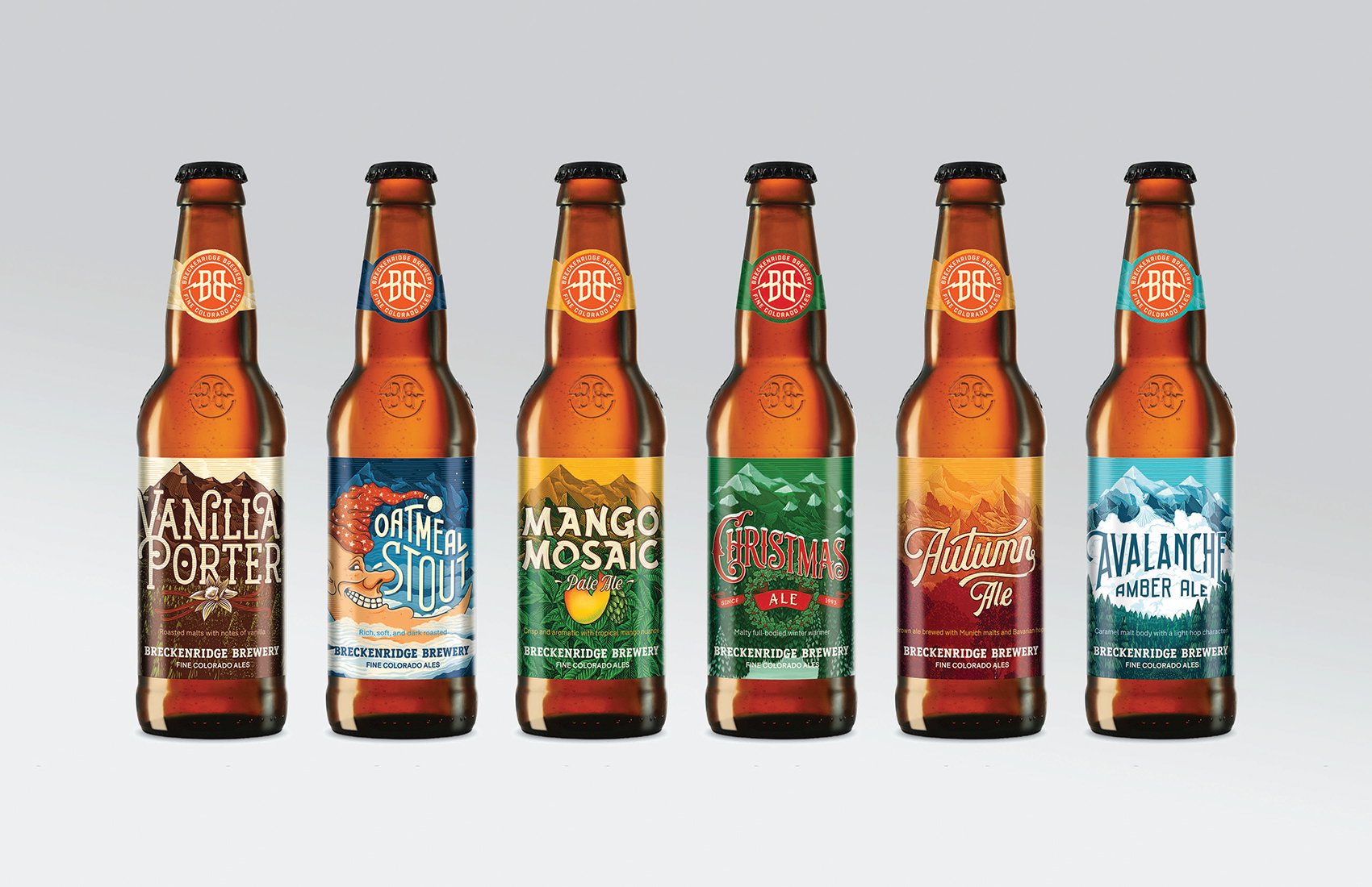
Bottle Label Designs
We designed the packaging to give each flavor its own unique personality within the Breckenridge brand. By carving out space for custom typography, every bottle could highlight its key flavors and stand out with its own distinct character.


Can Designs

Warehouse Cases
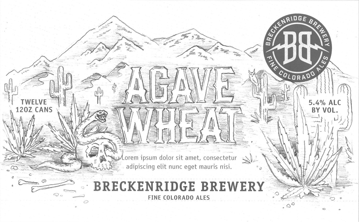
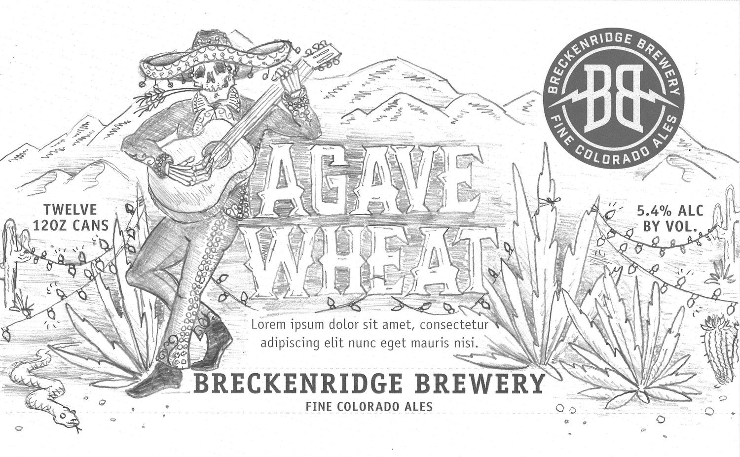
Agave Wheat

I was closely involved in the design of the Agave Wheat beer. We explored a variety of concepts and typographic approaches together to shape the final direction. Below are just a few of my sketches.

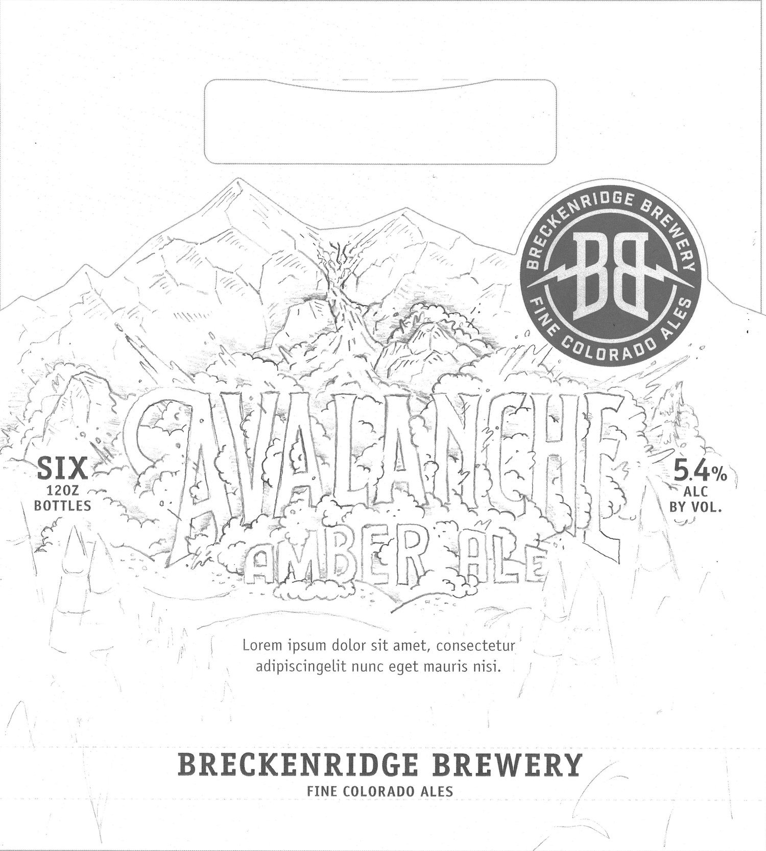
Avalanche Amber Ale

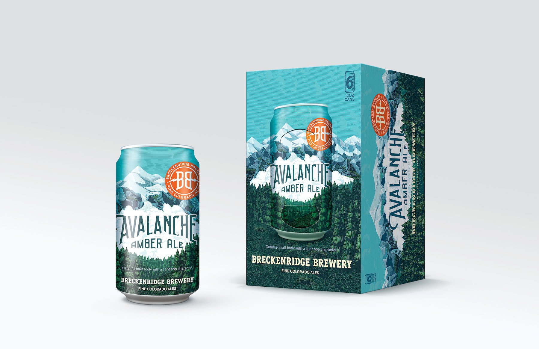

One of the biggest challenges in designing the Avalanche Amber Ale illustration was striking the right tone with the avalanche itself—we wanted it to feel dynamic without being overly explosive, and powerful without appearing sluggish.


Rocky Mountain Sampler

It was a true honor to work on the Rocky Mountain Sampler, a collection that highlights Breckenridge’s core beers alongside a special seasonal feature. I drew inspiration from the brewery’s roots as a humble mountain outpost, weaving in elements of whimsical folk culture to celebrate the spirit and storytelling and adventure at the heart of the brand.
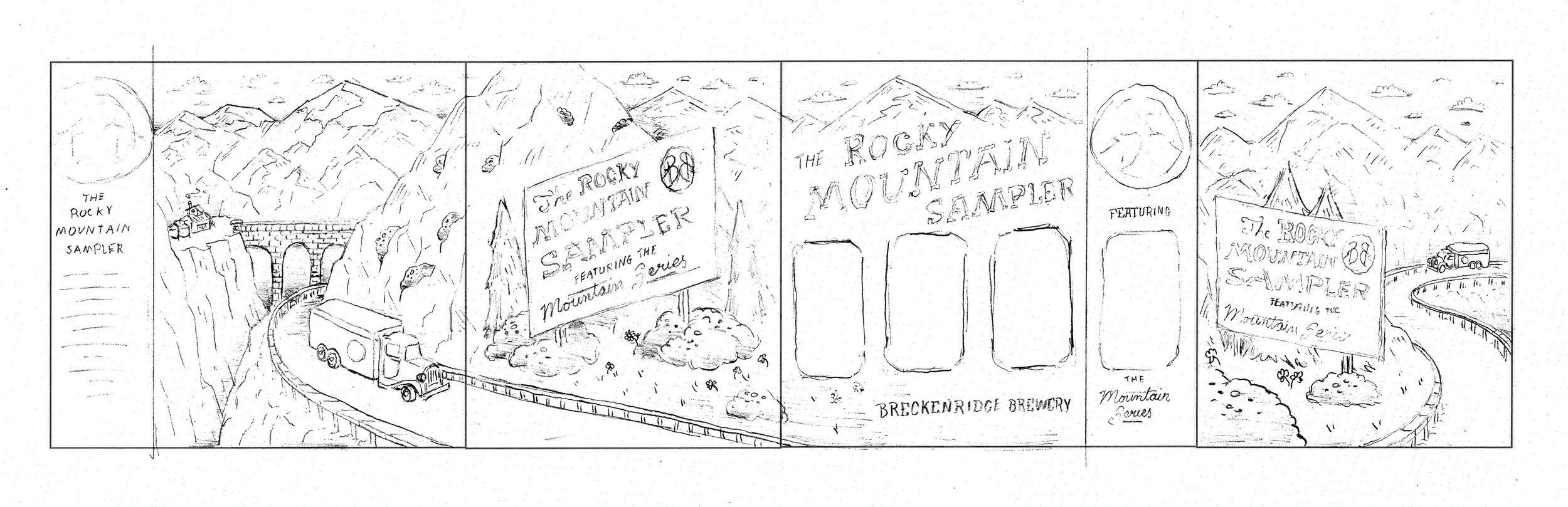
My sketch

Final Illustrations by Florian Schommer
